The first opening I have chosen to analyse is the Blair Witch Project, a very renown film, many people even thought it was real, which was the basis of it, it was meant to seem completely real and authentic. It is a very short opening, which begins with 'Artisan Entertainment', not a very well known production company, and to add to the 'do it yourself' feel, it has a slightly shaky look to it, the lettering is shaking a little, as if it were done by a hand held camera or done on an old film projector, it gives us the impression that it really was a group of students that did this, and it is funded by a small company, as it'd be rare for someone such as 21st Century Fox to back a group of students. This is backed up by the next part of the opening sequence, the Haxan Films is not a very well known company either, and yet again, the simplicity of it and the shaking suggests it was made by students, not a professional company that knows what it's doing.
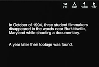 Once the title and 'explanation' of what was going on appeared, it was in very formal writing, a simple yet formal font and in full English Language, with only words needed to inform us. It is very much like a documentary, yet it still has that amateurish feel to it, due to the shaky nature of the words. After this, it goes straight into the film footage, so there is little else to tell, but it shows how they're going for the authentic feel, they don't tell us who the actors are, they don't tell us any costume designers, or even if there was a director, it just goes straight in, which really adds to the horror of the film (shown by many people believing it truly was real).
 'The Omen' Opening Scene
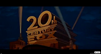
 Straight away, you know that The Omen is made by a higher class of Producers, the 21st Century Fox logo appears on the screen straight away, whilst in comparison to the new version of it it looks fairly dated, back then, it would have seemed new and the audience would instantly get connotations of a film with a larger budget and so forth it could quite possibly have more special effects. In similar text to 'The Blair Witch Project's, the producers names are shown afterwards, which is 'Twentieth Century-Fox' and 'Harvery Bernhard-Mace Neufeld', the second of which was not so well known, especially not back then, but it had a much more professional feel to it, the letters were perfectly still, you could tell it was professional just from that one, subtle difference. Next, the name 'Gregory Peck' is shown in large, bold lettering, Gregory Peck was one of 20th Century Fox's favourite actors between the 40s and 60s, so his name meant something, even in 1976 when this film was released, it backed up the feel that this was a large production, that such a big name was backing it. They seemed to almost be going out of the way to show off this, possibly to attract a large mainstream audience by showing off all the mainstream production companies and actors they had involved, they next showed Lee Remick, also a well known actress of her time.
 Afterwards, the titles 'The Omen' appeared, with background music which already began bringing suspense to the film, it began with just music, but then a 'choir' joined in, to back up the heavy beats of the non-diegetic sounds. Also, to the right, it shows the shadowed figure of a young boy, with a crimson light behind him, and his shadow made a cross, giving connotations of religion., the dark mist behind him gave a very dark feel to it, it wasn't thought of as a good, peaceful sign, or a sign of god, it seems very sinister, the shadow is very large, almost intruding out of the screen and at you. It then goes on to name the Directors, who wrote the music, and other such titles, the Director is last, to show his importance, the music climaxes then quietens down just as the credits end and the first scene starts, the last part of the credits is showing us the place and the date, just to set the scene, this is just a way to establish the scene, not particularly part of the credits, although it keeps that simplistic, white, plain feel to the text.


No comments:
Post a Comment