Tom Evans AS Media
Tuesday, 15 March 2011
Friday, 11 February 2011
Evaluation - Part Seven
Looking back at my preliminary task, what do I feel I have learnt in the progression form it to the full product?
During my preliminary task, my storyboard wasn't correct to the shots, they were all different, and also, instead of having a shot list, I did it one by one on the storyboard, so all of the shot reverse shots, etc, were out of place. Whilst in my main task I didn't actually use any continuity editing, if I had, I would have known better.
We organised our time better, instead of just saying randomly "Okay, lets go and film" whenever we felt, we planned when to meet, where, etc, so even though a bundle of things went wrong, we had planned to a decent standard.
The first time I used a camera for the preliminary task, it had a fade in and out setting which we didn't know how to turn off, so we just went with it, however, during the filming of our main task, the same thing happened, and we found our way onto the settings, and turned it off, showing our learning of technical devices, we also created a shot list, so we decided when to shoot when, and what we needed for it.
During the first task, I had no idea how to use premier, or any effects it could use, I only just found out how to put everything into a straight line. However, my post production skills became much better during the Main task, I properly taught myself how to use different effects, etc, including adding in sound, unlinking sound, titles, transitions, speed and fading.
I also found that I needed a much greater awareness of the target audience, which I didn't find out till during production, as I realised I needed to change the film and filming to better suit the audience, so it would interest them more so.
The biggest thing I have learnt during this process is either the post-production skills or realisation of how much planning and preparation is needed for creating films, etc, I had no idea how much work needed to go into something like this, and I completely underestimated it, if I hadn't, I probably could have created the film to a much higher quality, and if I went back to the start, knowing this, I think I could have gotten a much better grade than I will now.
Thursday, 10 February 2011
Evaluation - Part Six
What have I learnt about technologies from the process of constructing this product?
 For my research and planning, I used several new technologies of the age, this included using photoshop to create a moodboard for the Psychological Horror genre, I had never used Photoshop before, so it was something I learnt, even though I'm still not all that good with it, I know the basics. I also used facebook to question certain people who I thought would be a part of my audience to see their opinions on my ideas, etc, and what they would watch, it was mostly all good. To create my animatic storyboard, which we changed at a later date, I used a Digital SLR camera to take the pictures, then I uploaded them to my computer using Adobe Onlocation, afterwards, to create it into a moving set of images, I used Adobe Premier, we were originally going to take pictures of the actual places for the storyboard, but we couldn't, as we would have needed the main character (at the time) to get his clothes muddy, etc.
Blogging has helped me keep track of what I have done, and what kind of technology I used, and even when. It helped to track my memory so I was able to fully remember everything I have done. It also helped me to present my reserach in a clear, and very coherent way, it could have been easier to read/view, but it was still well shown, I think. I am able to find what I need to very easily.
I used youtube to upload my videos, it helped to get some feedback, due to the commenting system, after we uploaded the final piece, one person wrote which bit his favourite was, and saying how he thought it was (in his words) 'MINT'.
Before I began working on the film, I had no experience of On Location and Premier Pro at all. Now, I know all of the basics, and was able to learn plenty of things which I could use in media lessons within the future. I learnt how to fade in and out both sounds and images, which I thought was pretty cool, I had no idea you could even do that on this program (it is circled where you do it on the screen shot to the right). I also learnt, in a fair amount of detail, how to create title sequences with Premier, as during the editing process, I spent an entire lesson, simply working with it and finding out what all of the commands did, in the end, creating a very simple one, but if I wished, I probably could have created a fairly complex title sequence, if I had known how to use the fading tool on 'Video 2' I would have had titles during the actual film sequence also, also, I found out how to slow down and speed up what I had filmed on premier, which I used during our sequence, on the last time you see the main character, with the obviously scared look on her face.
To get my finished film opening on my blog, I first had to put it on my youtube account, afterwards, I had to click on "Edit HTML" and paste in the embedded code, which came up whilst I was uploading it. It was fairly simple, but actually got me stuck for a little while at first.
Technology has helped me to create a better evaluation by the use of images on the blog posts, I was going to use a video response to my video from people who watched it, but when I went to borrow a camera from the Media rooms, they were all out, so I was unable to, so I had to settle with using most images and text.
At times, the technology would crash, especially Premier and On Location. One time, I didn't save once through a lesson of editing, and lost everything I had done that lesson, I learnt that lesson the hard way, to save several times during editing. Also, the tripod on the camera wasn't brilliant, it kept moving, so we had to re-film several shots, several times.
Tuesday, 8 February 2011
Evaluation - Part Five
How did I attract/address my audience?
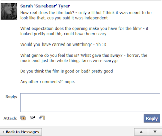
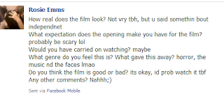 Within my film opening, the main thing I would have used to attract my audience, would have been the enigma codes, as there is no linear story to my opening, what attracts the audience is that there is no explanation of what is going on. But at the same time, it doesn't make you think too much, so forth fitting in with my target audience, as enigma codes (especially at the start) are often a favorite for mainstream horror audiences.
As shown by the comments, both of the Facebook responses I used showed that they liked the film and wanted to see more, meaning my enigma codes did indeed attract my audience, as both of them are more mainstream than anything, and come from a C1 and C2 background, they also both thought that the film could have been scary in the future, I think, from the responses I got, the faces of the teenagers staring directly into the camera were probably one of the scariest parts, to an older audience, it'd be threatening as teenagers are the unknown, and so often portrayed as the ruin of society, to each other though, teenagers can also be very scary, all it takes is a different social group to scare you, and this shows a large variety of people all staring directly into the camera, therefor at the audience. I didn't get any comments about the ever so slightly sexualized image of the character with the most screen time, but you probably wouldn't if you knew the person playing the character in real life anyway, but perhaps it was noticed less than I expected, if so, maybe it's better as it could have put off females from liking her, as it was, nobody showed any disliking for the character. The only thing people didn't particularly like is that some of the shots didn't look professional, which we felt we did the best we could with the equipment we had, but if we had more expenses, and more professional equipment, it could have looked much better.
They said they wanted to carry on watching, I think this is probably because of the enigma codes, they want to know why the main character was in distress, and why the faces were staring, more than one of the people I showed the video to asked me what was going on, and what would happen later on, even though I didn't know what would happen later on. Most of the expectations I had for the audience came through, I wasn't expecting proper terror or fear from them, I was expecting curiosity mostly, it wasn't meant to send true fear, just a slight worry. They all mentioned both the faces when asked on what made them think it was to be a Horror (they all said they thought it would be a horror), and they also mentioned the music, I think these two conventions definitely brought it to the horror genre, without it, I doubt it would have been quite as obvious, if obvious at all. The editing to give the main character a walk where we slowly got closer and closer to her face, until you saw her move in slow motion, glancing over at something we can't see gives horror conventions, along with the people staring into camera as the 'character' walks, the mise-en-scene we used on the characters staring into the screen was just a plain, white background, to give them all exactly the same background and stare, so they all have something in common whilst the main character doesn't, you can't focus on things in the background, just them.
Overall I believe my opening was fairly successful, it was obvious what we were going for, and the audience showed that they understood that, even if it wasn't perfectly professional, it still worked.
Monday, 7 February 2011
Evaluation - Part Four
Who would be the audience for my media product?
The target audience for my media product will consist of both the demographic and psychographic profiles of my audience. The age range will be generally be between 15 and 19, as they would be able to relate with my casting options better, and even the college environment is one they would be familiar with, both men and women would be targeted, women would be able to relate to the character, as obviously, she is also a woman, giving her a sense of independence, and men often don't mind having females as the main character, especially when she is sexualised slightly, as she is in our product. We initially were going to create a mainstream film, but once we started, it had more enigmatic elements than we had originally thought, and would quite possibly appeal to an indie audience, which could cross over to a mainstream audience, as it also has mainstream elements, like within the film Juno. The social classes we'd target would be C1, C2 and D, as the horror genre generally moves to these classes, it attracts the typical, working/middle classes of society, also, these classes would go to the cinema more.
Thursday, 3 February 2011
Evaluation - Part Three
What kind of institute might distribute your media product and why?
Our film would be distributed by Fox Searchlight Pictures, as a cross-over film, they often release lower budget films, even horrors, horrors such as 28 Days Later and The Hills have Eyes were distributed by Fox Searchlight. However, I will be focusing on how the film 'Juno' would be have been spread, an 'independent' film of sorts, which is mainly spread by the word of mouth. The results are obvious when shown, it's budget was $7,500,000, which is fairly small in comparison to some productions, such as Avatar. In the opening weekend, through just 7 screens, Juno brought in $413,869 on its first weekend(USA only), but by June 15 2008, it had brought in $143,429,840, showing how powerful the word of mouth can be.
 If we were to spread the word of mouth of our film, we'd obviously have an official website, which would be cheap to bring up, and, like the film shifty did, we'd send e-mails within, with an interactive 'image' on it, there would be about a dozen, normal teenagers simply staring out of the screen, straight at whoever was reading the e-mail, within the middle of the images, some sort of phrase using the films title 'The Coming' within it, and a rhetorical question to bring them in to click on the link to see what the film was. The internet is a very effective tool, for one thing, it is very cheap in comparison to buying adverts on the TV, or large posters, etc, and a younger audience uses the internet a lot, so I'd get straight to my main audience, as it's a cross-over, a mainstream audience will watch it, it'll get straight to them.
 At first, we'd be attempting to get our smaller cinemas, such as Arthouse and other small companies at first, before word began to spread and larger cinemas took us, we'd expect to me in vue and odeon cinemas within a few weeks, as the film became more visible to the mainstream audience.
Due to using Fox Searchlight, I would be able to use Synergy to help get word out of my film as well as the word of mouth. Due to the fact News Corp owns so many companies, I could get my film put through their media, such as adverts on their Fox Television channels, or within their magazines or newspapers, for example, the Daily Telegraph. News Corp also include holdings over websites such as myspace.com, so I could get internet adverts through the website, many teenagers use this website, so I could get advertisement straight to my target audience through that.
Our film would be distributed by Fox Searchlight Pictures, as a cross-over film, they often release lower budget films, even horrors, horrors such as 28 Days Later and The Hills have Eyes were distributed by Fox Searchlight. However, I will be focusing on how the film 'Juno' would be have been spread, an 'independent' film of sorts, which is mainly spread by the word of mouth. The results are obvious when shown, it's budget was $7,500,000, which is fairly small in comparison to some productions, such as Avatar. In the opening weekend, through just 7 screens, Juno brought in $413,869 on its first weekend(USA only), but by June 15 2008, it had brought in $143,429,840, showing how powerful the word of mouth can be.
 If we were to spread the word of mouth of our film, we'd obviously have an official website, which would be cheap to bring up, and, like the film shifty did, we'd send e-mails within, with an interactive 'image' on it, there would be about a dozen, normal teenagers simply staring out of the screen, straight at whoever was reading the e-mail, within the middle of the images, some sort of phrase using the films title 'The Coming' within it, and a rhetorical question to bring them in to click on the link to see what the film was. The internet is a very effective tool, for one thing, it is very cheap in comparison to buying adverts on the TV, or large posters, etc, and a younger audience uses the internet a lot, so I'd get straight to my main audience, as it's a cross-over, a mainstream audience will watch it, it'll get straight to them.
 At first, we'd be attempting to get our smaller cinemas, such as Arthouse and other small companies at first, before word began to spread and larger cinemas took us, we'd expect to me in vue and odeon cinemas within a few weeks, as the film became more visible to the mainstream audience.
Due to using Fox Searchlight, I would be able to use Synergy to help get word out of my film as well as the word of mouth. Due to the fact News Corp owns so many companies, I could get my film put through their media, such as adverts on their Fox Television channels, or within their magazines or newspapers, for example, the Daily Telegraph. News Corp also include holdings over websites such as myspace.com, so I could get internet adverts through the website, many teenagers use this website, so I could get advertisement straight to my target audience through that.
Tuesday, 1 February 2011
Evaluation - Part Two
How does my media product represent particular social groups?
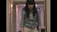 We only wondered about the costume of the main character, who was wearing black boots, tight white trousers and a shirt which was done up, but slightly rolled under to show off her stomach. This was an idea to give the character a sexual side to them, a very stereotypical view of women is that they are sexual objects, and are to be looked at, whilst we didn't use this view, as we didn't simply show her off, we only revealed to her belly slightly, we knew that it would draw in male viewers more if the main character had a slightly sexual element to them, however, the shirt isn't particularly feminine, giving off connotations that she isn't the typical girly girl, she is her own person and fairly normal teenager. It is a residual ideology that women should be a 'damsel in distress' and are less than men, they often were shown in peril, and saved from men, whilst our character will most likely be in distress, and quite clearly is in our opening, there is no male main character to save her, she is the main character, challenging these residual thoughts and making way for an emergent ideology that women are independent and don't need men all the time.
We filmed our work within the college, as it was the only real place that we could get lots of college students in, also the environment could be perfect for a chilling tale - if you're alone in college/school, a place usually brimming with life and excitement, so full of people, when you're alone in it, it suddenly seems very odd, and out of place, so as our main character walks down the corridor alone, it seems a bit odd, and you can see the worry in her eyes.
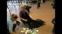 Everyone within our project was of a teenage, other than the cleaning ladies we used as extra's, the sudden appearance of two older character's was much more fearful than the others were as they were out of place, also, despite us looking down at them with the camera (or through the main character's eyes), it is seen that they are the in control, which is different, as usually those that are in control are above the other character, this is a dominant ideology as it is generally thought that the youth has a lot less power than the elder, which in this case, is very true as they are staff members and would have some level of control over the main character, this reinforces the dominant ideology, the fact they're on the floor, cleaning up the bins is a sense of realism to their occupation within the film.
The rest, however, are all teenagers, which, as it is a film for teenagers, is supposed to help bring out audience in, as the audience would be able to relate with the audience. Even the start, of having people stare at you can be related to, perhaps if one was to feel self concious, but it soon comes clear this is something more, but they would be able to understand the feeling of being stared at and watched and being judged.
We didn't actually think about it at the time, but we have only White British people within our film, it may show something about our ideology's that it's not important to have a mix of race, but at the time it didn't even cross our minds, it could be a dominant/residual ideology that the main character's of films are often white characters, and even more so, white males. We have, without thinking, reinforced part of this ideology, of having a white character as our main character, it shows something that we didn't even think about this.
The way our teenagers are made to look scary connotates what so many people think of teenagers nowadays, that we are scary, and that we could be coming to get them, a great deal of people think we're just a menace to society, and are all a lot darker than we actually are, this could be shown within our film, and is an idea we thought of before we began filming.
 We only wondered about the costume of the main character, who was wearing black boots, tight white trousers and a shirt which was done up, but slightly rolled under to show off her stomach. This was an idea to give the character a sexual side to them, a very stereotypical view of women is that they are sexual objects, and are to be looked at, whilst we didn't use this view, as we didn't simply show her off, we only revealed to her belly slightly, we knew that it would draw in male viewers more if the main character had a slightly sexual element to them, however, the shirt isn't particularly feminine, giving off connotations that she isn't the typical girly girl, she is her own person and fairly normal teenager. It is a residual ideology that women should be a 'damsel in distress' and are less than men, they often were shown in peril, and saved from men, whilst our character will most likely be in distress, and quite clearly is in our opening, there is no male main character to save her, she is the main character, challenging these residual thoughts and making way for an emergent ideology that women are independent and don't need men all the time.
We filmed our work within the college, as it was the only real place that we could get lots of college students in, also the environment could be perfect for a chilling tale - if you're alone in college/school, a place usually brimming with life and excitement, so full of people, when you're alone in it, it suddenly seems very odd, and out of place, so as our main character walks down the corridor alone, it seems a bit odd, and you can see the worry in her eyes.
 Everyone within our project was of a teenage, other than the cleaning ladies we used as extra's, the sudden appearance of two older character's was much more fearful than the others were as they were out of place, also, despite us looking down at them with the camera (or through the main character's eyes), it is seen that they are the in control, which is different, as usually those that are in control are above the other character, this is a dominant ideology as it is generally thought that the youth has a lot less power than the elder, which in this case, is very true as they are staff members and would have some level of control over the main character, this reinforces the dominant ideology, the fact they're on the floor, cleaning up the bins is a sense of realism to their occupation within the film.
The rest, however, are all teenagers, which, as it is a film for teenagers, is supposed to help bring out audience in, as the audience would be able to relate with the audience. Even the start, of having people stare at you can be related to, perhaps if one was to feel self concious, but it soon comes clear this is something more, but they would be able to understand the feeling of being stared at and watched and being judged.
We didn't actually think about it at the time, but we have only White British people within our film, it may show something about our ideology's that it's not important to have a mix of race, but at the time it didn't even cross our minds, it could be a dominant/residual ideology that the main character's of films are often white characters, and even more so, white males. We have, without thinking, reinforced part of this ideology, of having a white character as our main character, it shows something that we didn't even think about this.
The way our teenagers are made to look scary connotates what so many people think of teenagers nowadays, that we are scary, and that we could be coming to get them, a great deal of people think we're just a menace to society, and are all a lot darker than we actually are, this could be shown within our film, and is an idea we thought of before we began filming.
Sunday, 30 January 2011
Evaluation - Part One
In what way does my media product use, develop or challenge
forms and conventions of real media products?
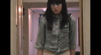 Firstly, it is instantly visible that my product is a film opening, it begins with a production company, which we made:'Urban Studios', it is shown in a credit format in the title sequence, very plain lettering, to follow with the rest of our titles, with white as a contrast on the black, this follows a convention of horror films, to use simple, white lettering on a black background, it is used in both of the films we analysed for our research. It is shown as a film start as it doesn't make complete sense, it isn't telling an entire story, which whilst some do, others don't, it shows Enigma, which is often in film title sequences to draw the audience in. Also, within the film, you are introduced to the main character, not for long, but for just a few seconds as she walks down the corridor with a suspicious look upon her face, the editing slowly brings her closer and closer to the camera. As is customary in most film openings, we used music within it. However, unlike most openings, we did not the follow a convention of giving a proper introduction to the main character, or having some sort of storyline within the piece. Finally, at the very end of the piece it shows the title, as is often shown at the end of the credits.
My piece is shown to be a Psychological thriller as in several ways, firstly, the music has a Gothic tone to it, with a mixture of uncertainty, it puts emphasis on the unknown feature to my piece, adding to the enigma.
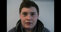 Also, the mise-en-scene is thought of, especially when you see the close-ups of the faces, all of the backgrounds are a plain white wall behind them, it stops you from focusing on anything in the background, just on their staring eyes, to add to the fear factor from the enigma. Also, using the camera as a first person point of view to just see normal people staring at us as if we are weird, or among that sort of thing helped us show that we were within the mind of the character, meaning we were able to understand that it is a slightly more psychological film straight away.
The non-diegetic sound (the music) also connotes a horror genre, as it is fairly typical music that you'd hear within the genre itself.
As for challenging these conventions? We have in ways. A mix of people staring at the camera's are both male and female, most of the time, if a female is the main character, it will be men chasing after her, a sort of damsel in distress, only in a few later versions of horrors have females been the main fear of a horror. But the quote; "Genres are not static but shifting and slippery, evolving over time" allows all film creators to change genres ever so slightly, as otherwise they'd get boring, as backed up by a second quote; "Pleasure is derived from repetition and difference." Meaning that we want both repetition and change at the same time, in the film industry, it'd mean keeping some conventions of the genre, but changing others so it's not always the same and doesn't get boring.
I also find that one of the regular conventions for Horror film openings is either everything is completely calm for the first 20 minutes of the film, or something in that region, or it starts off with something big happening, then the calm begins. In ours, there is no calm, or big thing that happens, you don't have any idea, therefore it pulls away from this convention, yet at the same time, keeping ever so slightly to it.
Another breakaway from how film openings are generally shown, is that we haven't properly introduced any character, obviously you can tell that the female walking down the corridor is more important than others, but you can't really tell anything about her, you can see she's scared and alone within a college, that she doesn't mind showing off her skin a little bit, and obviously cares for her hair, as she has styled it well, yet you don't know much else.
Friday, 28 January 2011
Monday, 10 January 2011
Filming Update
Most of the filming we did on the weekend and Friday is now void because of a few different problems, one of these was one of our cast members messing around, who is no longer a part of the filming. Also, we couldn't film on sunday because we needed to be in the woods but by the time everything was ready, it was too dark. Some of the footage we filmed was of a bad quality also, so we will be redoing it during Tuesday daytime and just after college. We will be using the same Risk assessment as before, so see the post below to read it. The cast list will be updated for who we're using.
Thursday, 6 January 2011
Organisation - Casting
This is the castlist for our 2 minute feature film, as it is posted currently, it is not all 100% definite, I will update it after the filming to show our organisation skills on who kept their parts and who didn't, I will also include a full list of extras.
Castlist:
Main Character: Paul Austin
Best friend: Sarah Tyrer
Organisation - Locations
The only locations we shall be using is the college itself, which will work well for the 'everyday' life of my character and also, the woods, which is a public space, our teacher said it would be okay to use them. These should be the only places we'll use.
Tuesday, 4 January 2011
Friday's Filming - Explanation & Risk Assessment
Friday, Saturday & Sunday's Filming
On Friday 7th January and the following weekend we will begin filming for the first time, we have already written out our Risk Assessment and have carried out the necessary checks for filming. We have gotten our actress' ready, and will have everything we need, the props we need will be ready also. We may be taking some pictures during the filming to upload to the blog and if things go as we expect, we may have to continue filming onto the weekend also.
Risk Assessment
Risk Assessment
Potential Danger | Potential outcomes | Actions to avoid potential outcomes | Further comments |
Slipping on mud of the wood floor. | Injuring an ankle, tripping into a bush/tree or hitting face on the floor. | Give the actors a pair of boots to wear between shoots to lessen the chance of slipping. | None. |
Injuring self by falling. | |||
Do not touch the wooden fence with bare skin. | None. | ||
Tripping over a fallen log. | Injury to the face or body, example: broken nose, graze hands or knees. | Clear the area before we use it for filming. | None. |
Hit by a car in the car park. | Death, serious-mild injuries. | Do not film on the carpark and have extra road safety. | |
Monday, 20 December 2010
Synopsis
In the opening of our film will begin in a wood, with the main character walking through with a rather nervous sense to them, you soon get the idea of them being followed, before an ellipsis shows them dead on the floor, between this some of the credits are shown. Then, it flashes back to two days earlier, when she is just another girl in College, she ends up in lesson with a friend, texting under the desk, then she gets a funny text saying to 'look in her bag', she does and she finds the corpse of an animal within there, the starting sequence ends with that.
Thursday, 9 December 2010
Genre Research Summary
After having researched my genre - Psychological Horror - I have been able to summarise what I have found out from my close analysis.
 The titles very often are simply, a black background with white, plain writing, to give it more of a formal feel almost, very often Psychological Horrors are portrayed as reality, to add to the fear factor, many people believed The Blair Witch Project was genuine, and the Paranormal Activity films are also filmed much like a documentary, it is often shown as a slow pace, with an amateurish feel to it. The pace is slow and it usually tells us little other than the title of the film and the production companies (the amateur feel is often better if a less well known company is used).
The music is one of the most key parts in horrors itself, and especially so in psychological horrors, in Paranormal Activity, you can often tell when something is going to happen as a light bass can very slowly be felt being built up, which builds up with tension. However, in The Blair Witch Project, there is much less non-diegetic sounds all together, as it is supposed to be a documentary from a camera, so adding music would remove that feel of it. In my film, I will look at using music for the starting sequence, because it is hugely important within the genre.
Very often, the main characters are portrayed in the opening credits, and something I noticed is that very often there is a relationship within horror films itself, and even more so in my sub-genre, it is often to show the destruction of their relationship from whatever horror comes, or, it could be a beacon of hope, but that is a much rarer occurrence, as horror is meant to scare and terrify it's audience, and if whatever they're against can destroy their relationship, and leave them alone and vulnerable, what can't it do?
Generally, the mise-en-scene is set within a fairly normal place, nowhere completely out of this world(literately or not). For example, Paranormal Activity is set within a normal persons house after they begin to believe they are being haunted. I have found no generic thoughts on the costume, other than they are often fairly normal people within these films. At the start, when everything is fine (Which is usually begins at with not just my sub-genre, but with most horrors) the lighting is usually normal, and if anything a little bright, it's not until a little way into the film when the lighting all begins to change.
There is just about always use of enigma codes, it makes us ask questions, we want to know what happened, why, what is going on? In Paranormal Activity, you instantly begin to ask these questions as the strange occurrences begin to happen, you want to know what the demon wants, and what is it going to do? Just as with The Blair Witch Project, you want to know what's after them, and at the start, what's so special about this footage, why did they disappear? It doesn't tell you this, it only gives you enough detail to get your mind going.
Within psychological horrors, there is a large contrast, in some of the films there may be very quick paced, different camera angles and much editing and cinematography, however, in others, there may be no editing whatsoever, especially if its done from an amateur point of view, so you can go in either directions, I think we are going to be going in the direction of the quick paced version which goes more into the story and less about the fear coming from the fact you are unable to see anything but what the camera sees, you can't even see everything the characters can.
Target Audience
Our target audience will involve the age of 15-19 years old, as it is often a more youthful audience which will watch horrors, also, the actors will be of that age, so they can relate to the character, if we cast an older audience, it may have been best to try and involve an older audience. We will have both male and female, however, females will be targeted slightly more so, as they could relate to the main character, who is a female. We would go for a mainstream audience, as other audiences, such as rebels, aren't so much into horror films, which are very popular in today's culture, especially by the mainstream audience, which takes up most of the market. We would also include in the social classes of C1, C2 and D this is the audience that would most go to the cinema on regular occasions, the B and A classes may prefer somewhere a little more high class, also, C1, C2 and D has the most amount of people in the mainstream class, so forth, the most people who would wish to watch a horror, also the cinema attracts more of the typical, working and middle class members of society.
Film Openings - Genre Specific Analysis
'The Blair Witch Project' Opening Scene
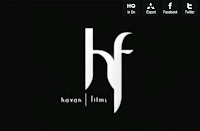
The first opening I have chosen to analyse is the Blair Witch Project, a very renown film, many people even thought it was real, which was the basis of it, it was meant to seem completely real and authentic. It is a very short opening, which begins with 'Artisan Entertainment', not a very well known production company, and to add to the 'do it yourself' feel, it has a slightly shaky look to it, the lettering is shaking a little, as if it were done by a hand held camera or done on an old film projector, it gives us the impression that it really was a group of students that did this, and it is funded by a small company, as it'd be rare for someone such as 21st Century Fox to back a group of students. This is backed up by the next part of the opening sequence, the Haxan Films is not a very well known company either, and yet again, the simplicity of it and the shaking suggests it was made by students, not a professional company that knows what it's doing.
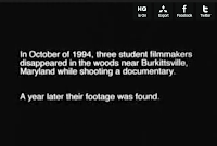 Once the title and 'explanation' of what was going on appeared, it was in very formal writing, a simple yet formal font and in full English Language, with only words needed to inform us. It is very much like a documentary, yet it still has that amateurish feel to it, due to the shaky nature of the words. After this, it goes straight into the film footage, so there is little else to tell, but it shows how they're going for the authentic feel, they don't tell us who the actors are, they don't tell us any costume designers, or even if there was a director, it just goes straight in, which really adds to the horror of the film (shown by many people believing it truly was real).
 'The Omen' Opening Scene
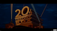
 Straight away, you know that The Omen is made by a higher class of Producers, the 21st Century Fox logo appears on the screen straight away, whilst in comparison to the new version of it it looks fairly dated, back then, it would have seemed new and the audience would instantly get connotations of a film with a larger budget and so forth it could quite possibly have more special effects. In similar text to 'The Blair Witch Project's, the producers names are shown afterwards, which is 'Twentieth Century-Fox' and 'Harvery Bernhard-Mace Neufeld', the second of which was not so well known, especially not back then, but it had a much more professional feel to it, the letters were perfectly still, you could tell it was professional just from that one, subtle difference. Next, the name 'Gregory Peck' is shown in large, bold lettering, Gregory Peck was one of 20th Century Fox's favourite actors between the 40s and 60s, so his name meant something, even in 1976 when this film was released, it backed up the feel that this was a large production, that such a big name was backing it. They seemed to almost be going out of the way to show off this, possibly to attract a large mainstream audience by showing off all the mainstream production companies and actors they had involved, they next showed Lee Remick, also a well known actress of her time.
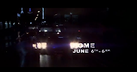 Afterwards, the titles 'The Omen' appeared, with background music which already began bringing suspense to the film, it began with just music, but then a 'choir' joined in, to back up the heavy beats of the non-diegetic sounds. Also, to the right, it shows the shadowed figure of a young boy, with a crimson light behind him, and his shadow made a cross, giving connotations of religion., the dark mist behind him gave a very dark feel to it, it wasn't thought of as a good, peaceful sign, or a sign of god, it seems very sinister, the shadow is very large, almost intruding out of the screen and at you. It then goes on to name the Directors, who wrote the music, and other such titles, the Director is last, to show his importance, the music climaxes then quietens down just as the credits end and the first scene starts, the last part of the credits is showing us the place and the date, just to set the scene, this is just a way to establish the scene, not particularly part of the credits, although it keeps that simplistic, white, plain feel to the text.

The first opening I have chosen to analyse is the Blair Witch Project, a very renown film, many people even thought it was real, which was the basis of it, it was meant to seem completely real and authentic. It is a very short opening, which begins with 'Artisan Entertainment', not a very well known production company, and to add to the 'do it yourself' feel, it has a slightly shaky look to it, the lettering is shaking a little, as if it were done by a hand held camera or done on an old film projector, it gives us the impression that it really was a group of students that did this, and it is funded by a small company, as it'd be rare for someone such as 21st Century Fox to back a group of students. This is backed up by the next part of the opening sequence, the Haxan Films is not a very well known company either, and yet again, the simplicity of it and the shaking suggests it was made by students, not a professional company that knows what it's doing.
 Once the title and 'explanation' of what was going on appeared, it was in very formal writing, a simple yet formal font and in full English Language, with only words needed to inform us. It is very much like a documentary, yet it still has that amateurish feel to it, due to the shaky nature of the words. After this, it goes straight into the film footage, so there is little else to tell, but it shows how they're going for the authentic feel, they don't tell us who the actors are, they don't tell us any costume designers, or even if there was a director, it just goes straight in, which really adds to the horror of the film (shown by many people believing it truly was real).
 'The Omen' Opening Scene
 Straight away, you know that The Omen is made by a higher class of Producers, the 21st Century Fox logo appears on the screen straight away, whilst in comparison to the new version of it it looks fairly dated, back then, it would have seemed new and the audience would instantly get connotations of a film with a larger budget and so forth it could quite possibly have more special effects. In similar text to 'The Blair Witch Project's, the producers names are shown afterwards, which is 'Twentieth Century-Fox' and 'Harvery Bernhard-Mace Neufeld', the second of which was not so well known, especially not back then, but it had a much more professional feel to it, the letters were perfectly still, you could tell it was professional just from that one, subtle difference. Next, the name 'Gregory Peck' is shown in large, bold lettering, Gregory Peck was one of 20th Century Fox's favourite actors between the 40s and 60s, so his name meant something, even in 1976 when this film was released, it backed up the feel that this was a large production, that such a big name was backing it. They seemed to almost be going out of the way to show off this, possibly to attract a large mainstream audience by showing off all the mainstream production companies and actors they had involved, they next showed Lee Remick, also a well known actress of her time.
 Afterwards, the titles 'The Omen' appeared, with background music which already began bringing suspense to the film, it began with just music, but then a 'choir' joined in, to back up the heavy beats of the non-diegetic sounds. Also, to the right, it shows the shadowed figure of a young boy, with a crimson light behind him, and his shadow made a cross, giving connotations of religion., the dark mist behind him gave a very dark feel to it, it wasn't thought of as a good, peaceful sign, or a sign of god, it seems very sinister, the shadow is very large, almost intruding out of the screen and at you. It then goes on to name the Directors, who wrote the music, and other such titles, the Director is last, to show his importance, the music climaxes then quietens down just as the credits end and the first scene starts, the last part of the credits is showing us the place and the date, just to set the scene, this is just a way to establish the scene, not particularly part of the credits, although it keeps that simplistic, white, plain feel to the text.
Wednesday, 1 December 2010
Genre Moodboard
A moodboard is poster of types which contains images, texts and samples of objects which show a concept of design and to communicate ideas with other people in a rather simplistic way. It would be good to show a target audience to see their opinion upon it. They are often used by graphical designers to give the idea of the genre of what they're doing, in my example, it's about a Psychotic Horror, but it could be about anything, a music video or even a book.
Thursday, 25 November 2010
First Ideas
I partnered up with Georgia in this task, we originally thought of doing a teen drama movie, but we soon decided it sounded a bit cheesy or many others would do the exact same thing, we talked and eventually came onto the idea of a psychological horror movie, like Paranormal Activity and The Blair Witch Project where the horror comes from your mind, and isn't just randomly stabbing and killing people like in so many films today.
We have began to research into this, and we are going to be looking at the film starts in more detail when we get the opportunity.
Wednesday, 24 November 2010
From Concept to Screen: How does the Credit Sequence from Dexter Work?
 This credit sequence has a very large amount of creative ideas, which generally stems from the thought that all things, no matter how normal they seem have a violent undercurrent in some way or form. The sequence emphasises that very well. Eric Anderson, the Creative Director had an idea about crime scene's, not all blood and guts, dead bodies and weapons, etc, but more so about the feel of the photograph's felt, how it has it's own visual language, it all had a very mundane, yet sinister feel to it, which is exactly what he wanted.
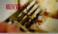 As they talked about the show, etc, with the creators, Anderson was noting down ideas as they went along, he nearly instantly thought of the title sequence having the word 'Dexter' upside down, as the concept was similar to Dexter himself, the word upside down looks almost exactly the same, and that's the same with the character, he isn't all that different as a murderer, no huge change actually happened. The sequence itself emphasised this darker meaning about Dexter in a simple yet complex way, I've never seen anything like it before in the opening credits, it makes it stand out so well. It makes everything normal into something violent, cutting an egg open to eat it seems violent, the way the sauce blurts out like a sudden spray of blood really backs up the violent imagery, however, it shows that the violent side is underneath, as the music is much more playful and bubbly in comparison to the original music chosen. It doesn't simply fixate him as an evil man and nothing else, it allows room for other things also, to show he could also be a normal person. However, it could also connote that violence could be exciting to him, and that with everything he does he wishes for it, which is why his actions seem that angry all the time, but generally, I think that everybody could see the sinister side to this. Also, when he leaves the flat/house he is wearing very normal clothes, just a plain, baby blue shirt, which doubles up the idea of him being a normal guy, but yet again, you can still tell there's something slightly not right, he has this devious look in his eyes and a somewhat sinister smirk spread across his lips, it's a fairly bright contrast to what he's wearing, which are all soft colours, nothing dark or scary.
Within the scene, there is a large amount of scenes with noir lighting and a shallow depth of field, this is used to add to the atmosphere of this piece, it focuses the light on the object we're looking at (in the picture to the right, the fruit) and the depth of field only allows us to see what he's doing, it emphasises on the violent manner of which he is doing it, the insides of the fruit gushing out like blood and guts, the crimson insides of it adding to the look of it.
Research: Analysis of the Opening of Juno
Juno is very good at it's opening sequence in many ways. It begins with her walking down a street, then, as she walks behind a tree, the whole images changes from reality to a cartoon, including her, and then the credits begin, it shows that she is almost lost stuck in her own bubble, and that the world isn't very real to her yet, she still sees it through a child's eyes. It instantly shows the first production company, 'Fox Searchlight Pictures' which is Fox's attempt at an 'indie' film production. Within moments, a non-diegetic music begins, it is a very odd song, especially for a typical teenager to be listening to, it's very bubbly and unusual, yet the lyrics say 'If I'd be a tree, you be the leaves', this hints at a romance within this bubbly, teenage world, but in a very innocent and almost naive way, connoting to me that it my be a 'coming of age' journey in this film with the help of romance. The bottle of Sunny Delight in her hand also suggests at a child-likeness to her, as it is often thought of as children who drink Sunny D.
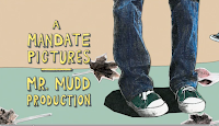 Her clothes aren't very extravagant, and her hair is tied back into a loose knot, it shows that she isn't too bothered by her appearance, she doesn't make too much of an effort, she seems a bit of a tomboy, but she is still fairly bright and stands out in comparison to the rest of the background, which is dull and drab, even more so when in it's cartoon form.
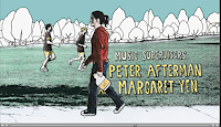 Soon enough there is a close up of her shoes on the floor, with leaves scattered around her, the leaves are a fairly dull brown, and her shoes are very average for an American teenager, it shows that her life is rather dull and that whilst she is different to other teenagers, she isn't extraordinary in any way, just a little odd.
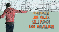 Soon enough she's walking down the road and in the background you can see a few people in a sports kit running past her, they don't seem to even notice her, they could possibly be the stereotypical 'jocks' America always seem to have. She doesn't seem to mind too much that they don't even notice her, conveying that she doesn't have have any real wish to join in with the trends of others, that she is her own person, which we as a society like to see in our TV and films.
 Her clothes aren't very extravagant, and her hair is tied back into a loose knot, it shows that she isn't too bothered by her appearance, she doesn't make too much of an effort, she seems a bit of a tomboy, but she is still fairly bright and stands out in comparison to the rest of the background, which is dull and drab, even more so when in it's cartoon form.
 Soon enough there is a close up of her shoes on the floor, with leaves scattered around her, the leaves are a fairly dull brown, and her shoes are very average for an American teenager, it shows that her life is rather dull and that whilst she is different to other teenagers, she isn't extraordinary in any way, just a little odd.
 Soon enough she's walking down the road and in the background you can see a few people in a sports kit running past her, they don't seem to even notice her, they could possibly be the stereotypical 'jocks' America always seem to have. She doesn't seem to mind too much that they don't even notice her, conveying that she doesn't have have any real wish to join in with the trends of others, that she is her own person, which we as a society like to see in our TV and films.
Towards the end of the start up credits, she can be seen to be balancing on the curbs in a very childlike manner and being off in her own world (yet again). She seems particularly care free, despite the fact that she is soon to be going to buy a pregnancy test(as we later find out), this possibly connotes naivety, she may not understand the seriousness of the situation, the mise-en-scene - the park - adds to the thought of her being childish and rather immature still, in a loveable way, which is why this film is thought of as so great, the start up credits stands out amongst so many others, so the creators did their job very well.
Monday, 22 November 2010
Research: Key Conventions
In research of the Key conventions, we have watched several movie openings, we watched 'Search for a Mignight Kiss', 'Brick', 'London to Brighton', 'Shifty', and 'Kick Ass', as we watched we wrote notes on the conventions of an opening to help for a later date.
One of the main points of the opening credits is to introduce us to the main cast and the crew, very often including the genre of the film, for example, in Kickass the Main Character voiced over and we could see somebody attempting to be a superhero, to set in motion what the film would be about, it also shows us how the narrative may work out, that we may have a narrator at points and that it should be fairly linear, as we're starting from before he became a Superhero, we also find out about Dave, and how he explains himself it shows that he is deprived of female attention and that it is nearly constantly on his mind, it is probably the main thing he talks about in the sequence, its a key convention that the film tells us about the character, even if its something his everyday friends don't know, we will.
Obviously, there is always the 'credits' of people involved in the film, very often shown in simple text in white, to make it stand out and easy to read, it shows the Production companies, the direction, the key actor, and sometimes even editors, costume designed, etc, but this is rarer occurance.
 Opening sequences can often use enigma codes, which is show in Brick to make us, the audience question what is happening, much like an ellipsis, we don't know what's happened and we want to find out, how is this girl injured?. The sequences often introduce key aspects to the characters' personality when showing the main character, in 'Brighton to London' it makes it clear just how desperate the two characters are, that the mother has to sell her body to a man just to make enough money for a train fare, it tells us about them, we will already have ideas about them.
 Of course, at some stage in the title sequence there will always say the title of the film, for example, in Kickass, the camera moves to the back of the Taxi, showing the licence plate as 'Kick Ass', this introduces the film to us and in Brick it has a very simple, white lettering on a black background.
There is often some kind of non-diegetic music within the start up sequence to show the flow of the film and often helping us with the genre of the film, in an example in the film Juno, when the rather spacey, bubbly music comes on, it shows that it's probably going to have lots of light hearted moments and the lyrics hint at a romantic comedy, it influences on the main characters personality, showing us about how she might be, still rather childish inside. We wouldn't use a heavy metal song for a romantic comedy, it just wouldn't fit, it's supposed to set the scene, it'd give completely wrong ideas about what the film would be.
One of the main points of the opening credits is to introduce us to the main cast and the crew, very often including the genre of the film, for example, in Kickass the Main Character voiced over and we could see somebody attempting to be a superhero, to set in motion what the film would be about, it also shows us how the narrative may work out, that we may have a narrator at points and that it should be fairly linear, as we're starting from before he became a Superhero, we also find out about Dave, and how he explains himself it shows that he is deprived of female attention and that it is nearly constantly on his mind, it is probably the main thing he talks about in the sequence, its a key convention that the film tells us about the character, even if its something his everyday friends don't know, we will.
Obviously, there is always the 'credits' of people involved in the film, very often shown in simple text in white, to make it stand out and easy to read, it shows the Production companies, the direction, the key actor, and sometimes even editors, costume designed, etc, but this is rarer occurance.
 Opening sequences can often use enigma codes, which is show in Brick to make us, the audience question what is happening, much like an ellipsis, we don't know what's happened and we want to find out, how is this girl injured?. The sequences often introduce key aspects to the characters' personality when showing the main character, in 'Brighton to London' it makes it clear just how desperate the two characters are, that the mother has to sell her body to a man just to make enough money for a train fare, it tells us about them, we will already have ideas about them.
 Of course, at some stage in the title sequence there will always say the title of the film, for example, in Kickass, the camera moves to the back of the Taxi, showing the licence plate as 'Kick Ass', this introduces the film to us and in Brick it has a very simple, white lettering on a black background.
There is often some kind of non-diegetic music within the start up sequence to show the flow of the film and often helping us with the genre of the film, in an example in the film Juno, when the rather spacey, bubbly music comes on, it shows that it's probably going to have lots of light hearted moments and the lyrics hint at a romantic comedy, it influences on the main characters personality, showing us about how she might be, still rather childish inside. We wouldn't use a heavy metal song for a romantic comedy, it just wouldn't fit, it's supposed to set the scene, it'd give completely wrong ideas about what the film would be.
Main Task
We will be filming the titles and opening of a new fiction film, to last a maximum of two minutes. The main purpose is to assess our ability to plan and construct media products with use of the appropriate technical and creative skills.
There will be a hundred marks, 20 of those marks are from the research and planning, another 20 is from the evaluation and the final 60 is from the final product.
The Research Deadline is for the 26/11/10, the Photo-Storyboard deadline is for the 3/12/10, the filming deadline for 07/01/11, the Production Deadline for the 28/01/11 and the salutation for the 11/02/11
Monday, 18 October 2010
Targets
I will need to meet these targets next time I am to do a task like this, there were several points I picked up on.
1. We didn't use a script, we made it up as we went along, next time we need to use a proper script.
2. We did not fully understand the equipment we were using, we should have found a way to turn off the fade in/out or waited a little longer so our camera angles didn't always have a white shot in them.
3. My storyboard was not very accurate, and it was worded wrong, next time it will need to be of a much better quality.
Wednesday, 13 October 2010
Evaluation
During this task I have learnt about continuity editing. It is a mix of camera shots and angle, edited to make the sequence seem continuous, the viewer should not notice the camera angles, if they do, then the editing or camera shots may be a little wrong. There are several key rules, you have to use a 180 degree rule, which means to keep one person must always stay on the same side of the camera shot, so if one person starts on the left side, they have to stay on the left side in the camera shots.
To take the photographs for our storyboards, we took photos using Digital SLR cameras. They were fairly simply to use, we only used picture taking and uploading the pictures to our computer, using a firewire cable. It was easy to use, much easier than I expected, I was very worried about breaking the camera somehow.
I have learnt a lot about organising filming. Mainly through our own faults, I realised we weren't very organised, we lost our script, we weren't knowledgeable about the cameras and we didn't generally plan it out very well, these were the main faults in our task.
We didn't know very much about video cameras, as is obvious by the fact we were unable to even turn off the fade in fade out feature on it. We only used the normal filming feature, on top of a tripod. We were all unsure about using it, especially after hearing it was new, we were terrified of breaking it, as with the camera.
To upload the files from the Digital Video Camera, we used Adobe OnLocation, a program which allowed us to upload each clip we needed from the tape bit by bit. Once we did that, we were able to get all the clips saved so we would be able to begin editing using Adobe Premier, which would allow us to make it all continuous.
I have learnt how to edit using the Premier software, however, due to the filming before, we weer unable to edit out the white fading without losing too much valuable footage, so we had to go with it, so we were a little taken aback, but we still continued and the final cut wasn't too bad, it wasn't brilliant, of course, but it worked. We will have a better knowledge for how to do it next time.
To get our video onto Youtube, we had to convert it's file type, which was simple enough, using Premier also when we saved it. Using blogger during this activity has helped us greatly, we were able to organise our work and put what we have done into perspective much better. We were able to present it well and it helped us well.
Monday, 11 October 2010
Post Production
The editing went fairly well, obviously, we had a few shots where we could not remove the white light, but the second half of the video was all pretty good, so we were able to edit it to a fairly decent quality, even through Georgia's terrible high five, we managed to edit out the bit where she almost fell straight from her chair in her... weird high five. The first few takes weren't' brilliant but they're the best we could get them, we would have retaken them but we were all wearing different clothes and it needed to be continuous, it would have been bad continuity if Alex had been wearing a different jacket or no jacket in the different parts. Other than these setbacks it all went well, and we all took part in the editing process.
Production
Production went fairly well, but wrong in some places, if not many. When we took out our camera to go film, we spent about fifteen minutes trying to get it all working well, the tripod and the actual camera itself, which still had a fade in and out every time we started filming, so at the start of the filming, there is occasional clips with a fade in and a fade out. It was a new camera, so even Lars was a bit unsure on how to turn it off. Also, we ended up losing the script, which was our own fault admittedly, so once we started filming, we simply did it shot by shot, which was the wrong thing to do, we should have filmed the entire sequence from one angle, then the other shot, then put them together.
So all in all, it didn't go brilliantly, but it could have gone so much worse, so we just hope it'll be up to scratch.
So all in all, it didn't go brilliantly, but it could have gone so much worse, so we just hope it'll be up to scratch.
Thursday, 7 October 2010
Pre-Production Tasks
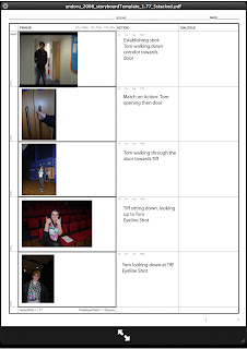 Before we began filming, we had to do several tasks. First of all we had to do a health and safety report (a risk assessment), to explain what could happen, the chance of it happening and how bad it would be if it did happen. Afterwards we began to create a storyboard and a script for the actual piece. After being unable to think of anything else, we decided to write the script on the weather. We used a camera for our storyboard, which explained what shots we would use and generally when. We scouted out to the hall, deciding to use it as it is generally empty and fairly open. We decided to cast ourselves in it, as we were a group of three.
Monday, 27 September 2010
Continuity Editing
Continuity editing is used in most drama's or films nowadays - it is meant to make the storytelling smooth, to make sure the viewer is able to follow the story well. The viewer should be unable to notice the cuts, so the shots can simply flow together as if it were natural. The narrative has to appear logical, coherent and continuous.
Continuity editing is used to make the viewer not notice any of the editing. The rules, such as the 180 degree rule all is a part of this. If you break the 180 degree rule during filming, the audience will suddenly notice it. During the
'Continuity' part of our Skins disk, it breaks the 180 degree rule, but then goes back to a master shot, establishing why they broke it, so it works, but generally it goes unbroken during filming.
The central elements of continuity editing involve the 180 degree rule - when two characters are facing one another they must never appear in the same half of the frame. Each time the camera cuts, they must remain in their half of the frame, otherwise the continuity of the scene will be broken. There is the match on action cut, this occurs when two pieces of footage of the same event but filmed in different ways are edited together to make them appear continuous. Next, there is the 30 degree rule. When changing the angle of the camera to film the same event you need to cut by at leas 30 degrees or you will produce a jump cut, which disrupts the flow of the narrative. There is also the eye-line match, where footage is matched to the eye line of the character. And, of course, there is the establishing shot, which simply establishes where you are and the shot reverse shot.
This is my first ever work on Photoshop, it is fairly basic, but it shows edits of Match on Action, the Shot Reverse Shot and the Eyeline Match.
Preliminary Task - Video Task
This task is a continuity task, I shall be filming and editing a character opening a door infront of them, crossing a rom and then sitting down in a chair opposite another character, they will then exchange a couple of lines of dialogue. This task shall demonstrate match on action, the shot and reverse shot and the 180-degree rule.
This is an exam board requirement, and I shall also include a cutaway and a cut in. I will ensure that these flow properly and are reasonably relevant to the conversation taking place.
This is an exam board requirement, and I shall also include a cutaway and a cut in. I will ensure that these flow properly and are reasonably relevant to the conversation taking place.
Thursday, 23 September 2010
Welcome
This is my first ever Blog, and I'm doing it for my Media Studies AS level at College, I'll be posting everything I do(Which I can, that is) and I will be regularly posting what has happened in Media Studies, an examiner will check it at the end of the year and then grade me, so hopefully I do well. ;)
Subscribe to:
Comments (Atom)


